← Back

LetsGo Yoga

The gym subscription model is dead.

LetsGo Yoga is a project I have been working on over last few months. It will be the new way to find yoga classes in London - when you want, where you want, at a price that suits you. LetsGo Yoga connects local yoga instructors with yogis across London and allows them to book a time without a subscription.

Our Problem

When searching to book a yoga in London, all you are confronted with is gym memberships and large health clubs. They all require you to purchase multiple lessons or subscribe to a membership. While this may work for them, we noticed a few issues and an opportunity to transform the market. We attended meet ups and networked at yoga events to test our theories. To reflect on this information we mapped the experience of hosting and booking a yoga class. We identified pain-points and from here we highlighted three areas where we could make an impact.

A membership is a barrier to entry for new students.

All current methods require you to sign up for a membership or a minimum number of classes. This can often be a large upfront payment that can discourage new students.

Currently word of mouth is the best way of finding a private teacher.

Large companies have such dominant Search Engine Optimisation (SEO) that it becomes very hard for the individual to be discovered on the web. Instead most new students rely on getting recommendations through their personal networks.

You book with a organisation not a human.

When booking online it very much feels like another digital transaction. This need to be personal, you need to know your teacher.  

Our users

We quickly found independent hero yoga teachers, running great classes and with real passion, but they were struggling to advertise themselves and get their name out there. By talking to potential customers we identified three key personas:

Our process

I started to build initial wireframe flows telling the story of Gemma listing a class and how it would be discovered and booked by Alex or Jack. These were critiqued by our users and the feedback was incorporated into the second iteration.

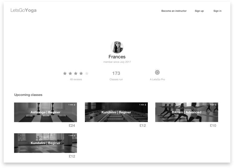
Correction of terminology. Teachers didn’t not like being referred to as instructors. Teachers never refer to a student or yogi as a client.

More teacher feedback. The star rating was very helpful as an initial indicator of a teachers quality but anecdotal reviews would give new students a real insight into the teacher.

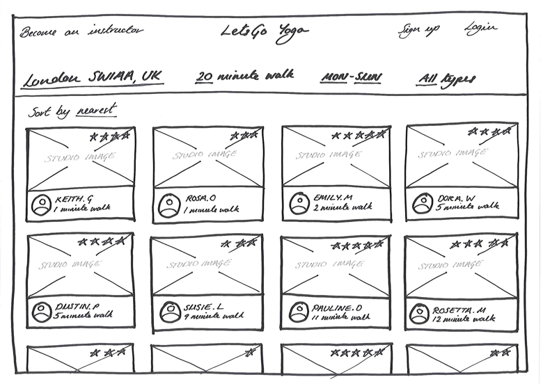
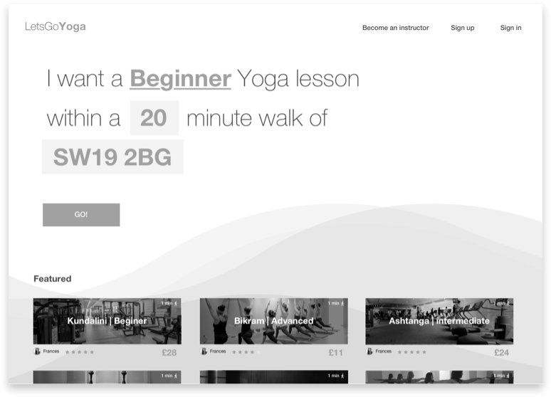
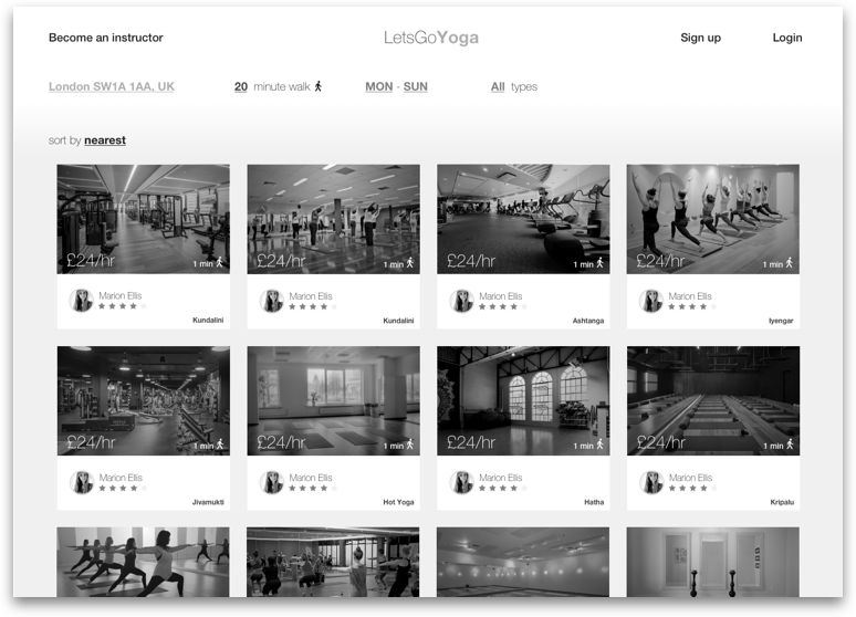
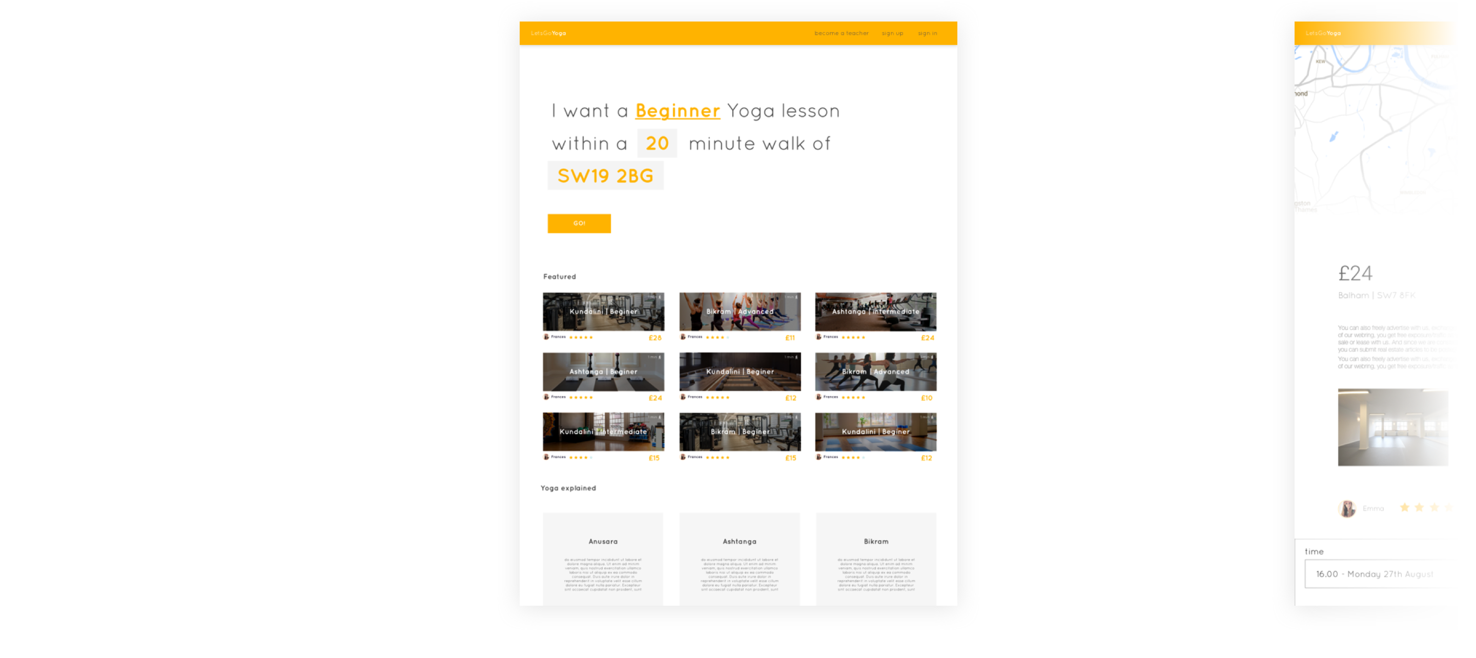
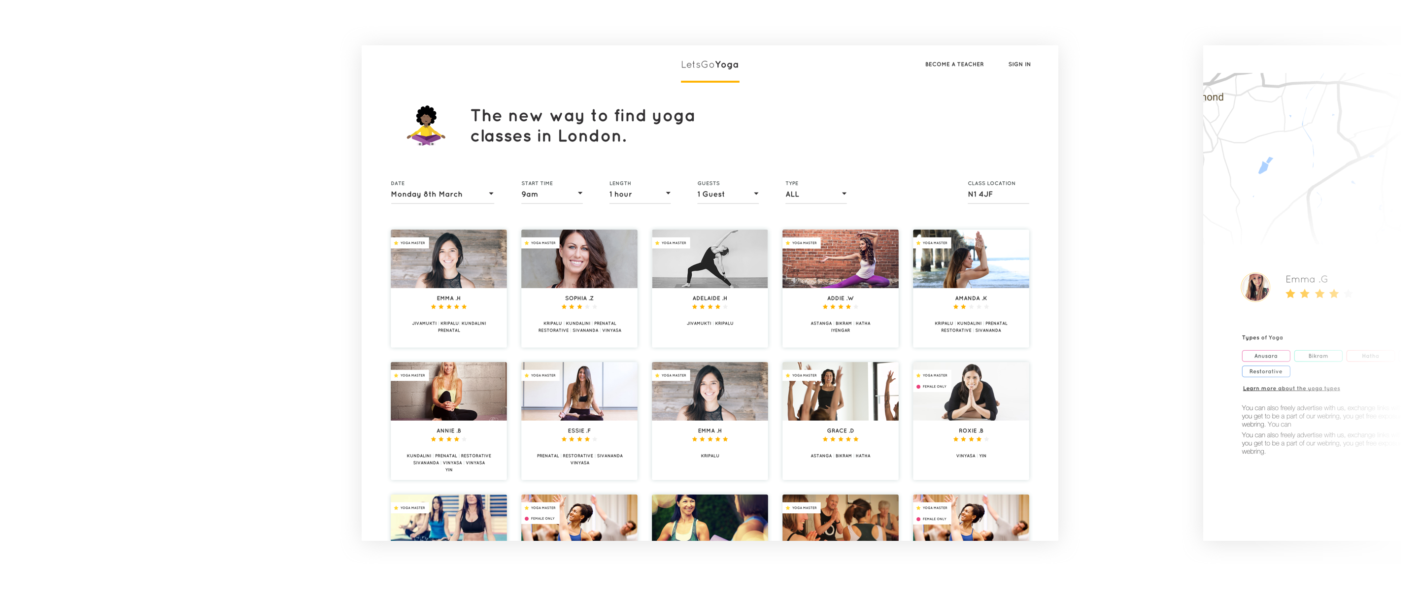
Yoga is a complex world with complex terminology. There are multiple types of yoga, Hatha, Ashtanga, Yin, etc. These are terms the teachers strongly aligned to. However, while testing with people that aligned especially with Jack they were keen on attending a class but didn’t know the difference. Some translations were required.

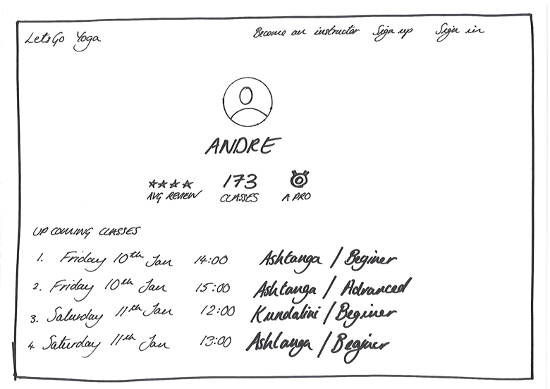
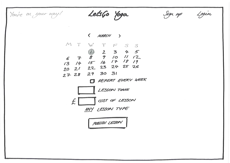
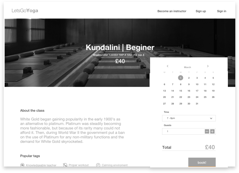
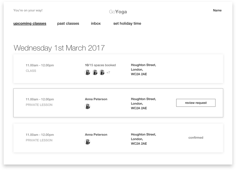
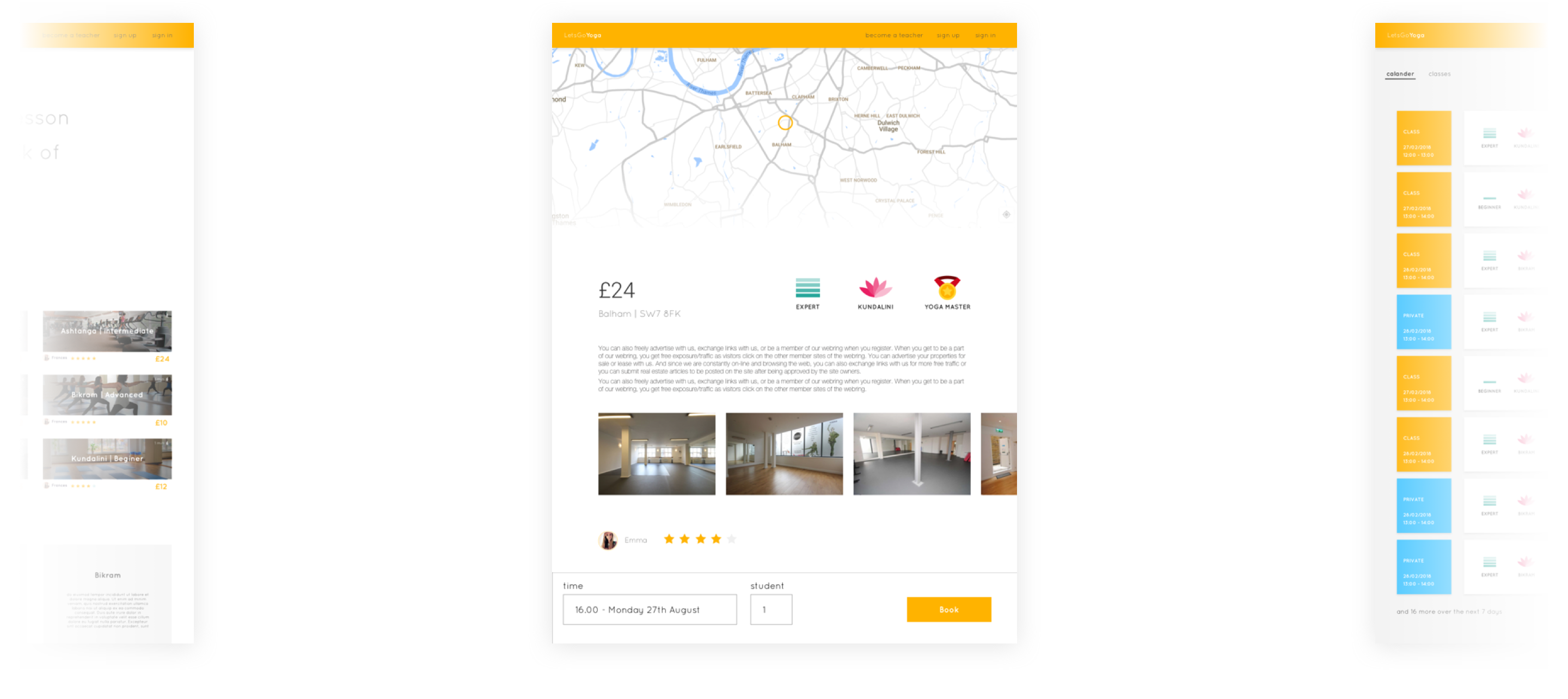
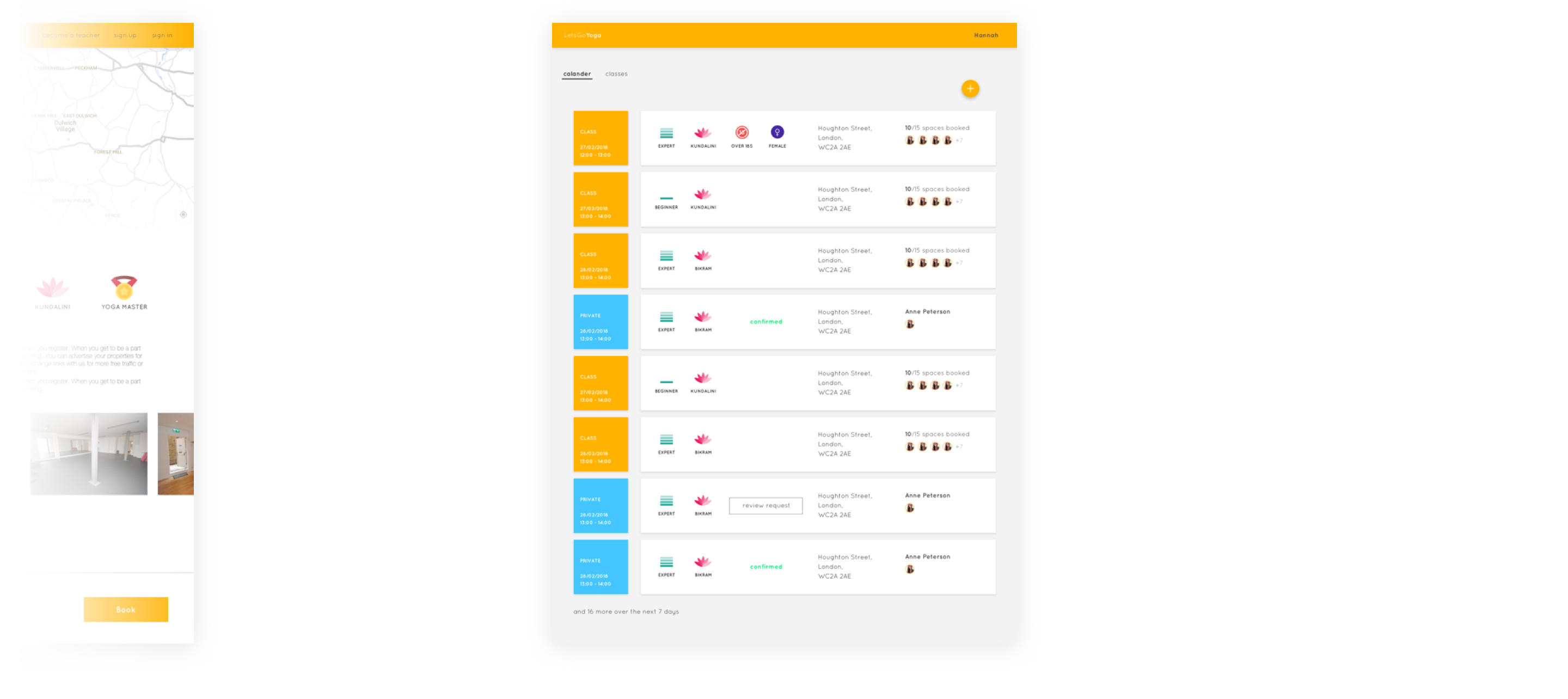
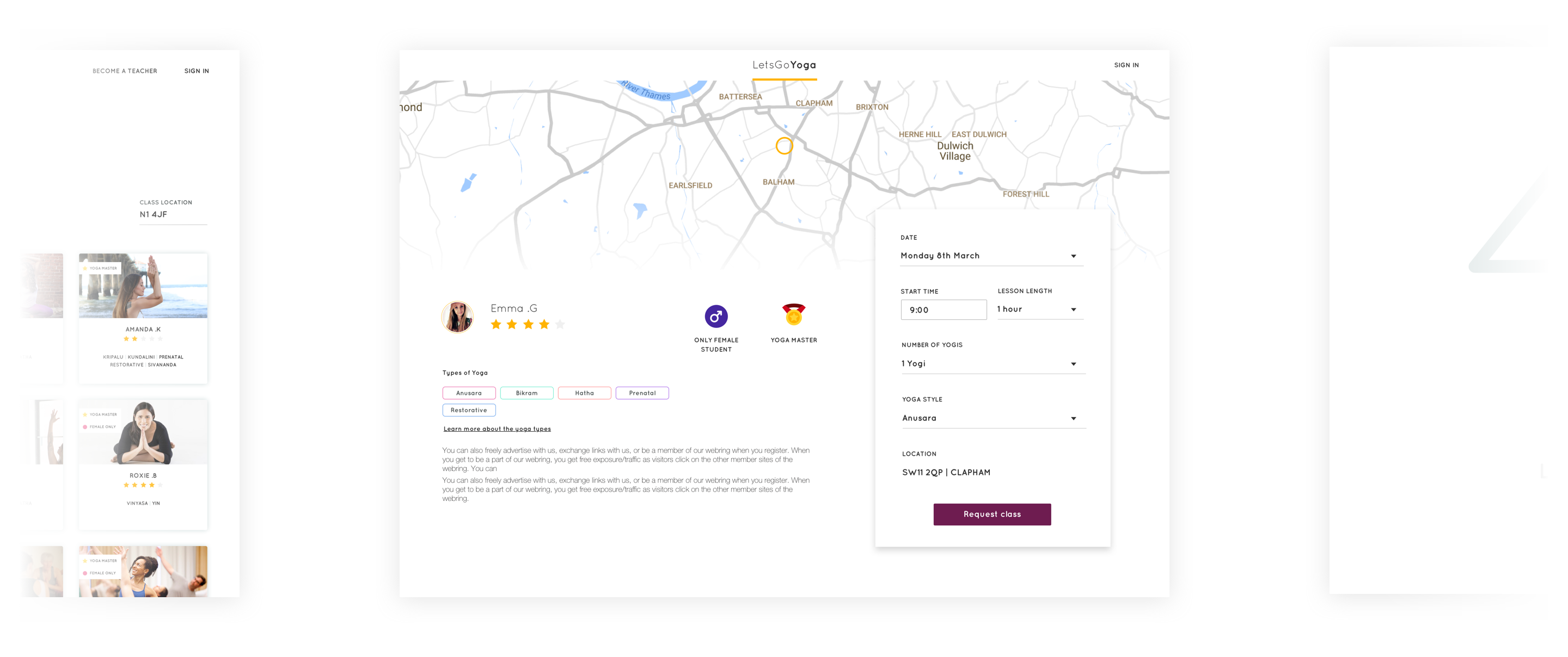
Teachers run a lot of one-to-one classes. Our designs only catered for booking pre-set classes. We needed to facilitate a student booking a teachers time for a one-to-one.

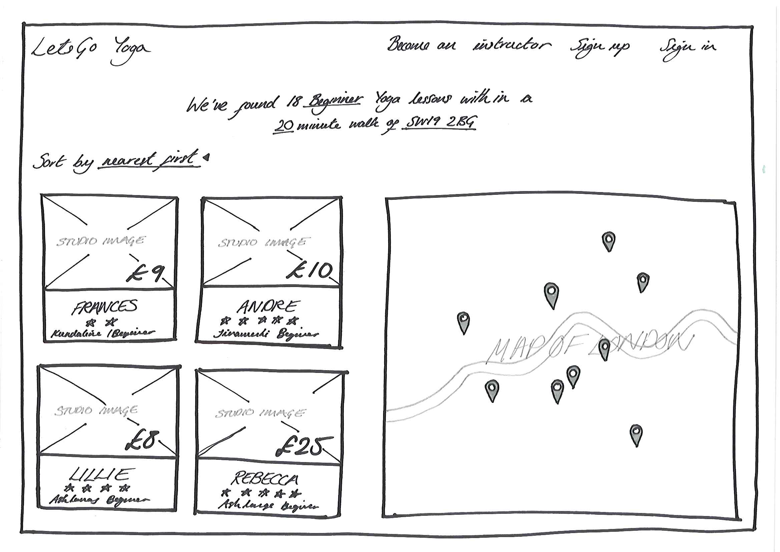
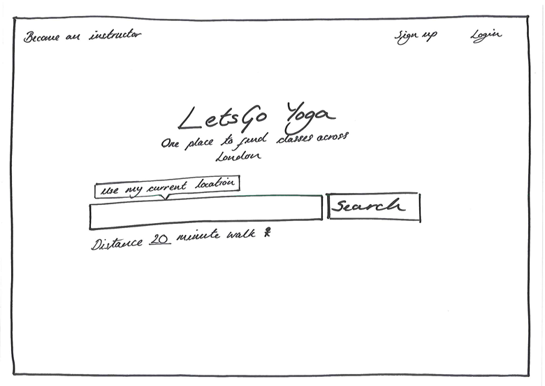
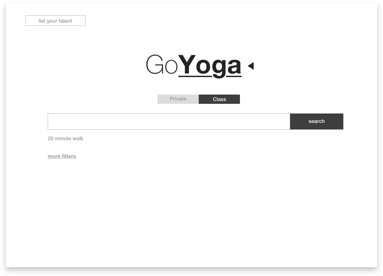
Class location was a major deciding factor. Many students wanted a class near their work or home. The map and filtering would greatly help in quickly removing unsuitable lessons.

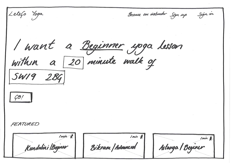
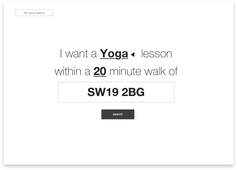
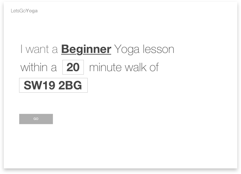
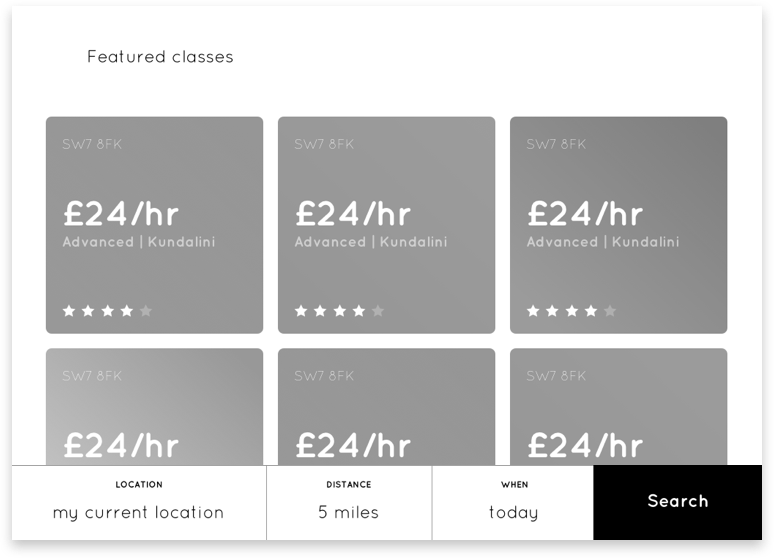
Students liked the conversational search. Students found it intuitive and agreed that they would be the three key search options. However, many wanted further filters.

Overall I felt first round of usability testing was successful. We had a huge amount of feedback to iterate upon but the concept held up.
We continued to iterate and refine based on user feedback.

While initially testing all our designs were pushed back to black and white. This ensured that all our feedback was on our concepts and not the branding. Towards the later stage I started introducing more detail and colour, this started to evoke real personal opinions on the design.

Through testing I started to refine all the ideas into a single concept. At the stage it was still a golden path design, with aspect still at a mid fidelity. The next stages would be to refine the whole design including the exception paths.

Try the prototype

The icons and quick explanations were particularly well received by students who closely match our Jack persona. They found this quick punch information a great way to break down the jargon associated with yoga. Overall the students also appreciated that they could understand a teacher at a glance. Creating icons like the ‘yoga master’ would also be a way of ensuring teachers continued to book and schedule using our platform.

At this point we had run with our user needs and excitement. We started designing and setting the infrastructure to a huge platform. However with a team of three and a market with competitors coming up everyday we decided this wouldn’t be the best decision for our company.  

This is the point where we identified that we needed to scope this project. We wanted to deliver the best experience to our user, as well as releasing as quick as possible and using our first releases as a opportunity to learn about the market. This became an exercise in reducing complexity while maintaining a quality experience.

We first agreed to only target teachers and students in London. We felt this gave us the perfect sample size. We also live locally allowing us to publicise and support in person. From here we found it difficult to agree upon a minimum viable experience. To do this we created a high-level flow map based on our experience and used this as a discussion point to create a minimum viable experience.

Based on this discussion we created a site map of our MVE (minimum viable experience).

Handle confirmation of classes in person  
To reduce the need for a complex backend we agreed that once a user has requested the time of a teacher we would manually request and confirm the instructors time.

Agreed to align as much of our design with react components
We agreed that once we had created the ideal design, I would work with our developer to ensure we were using common react comports where possible to speed up the development time.

Simplify the payment model
By having a single price for every teacher we could reduce the complexity of the Stripe integration. We also decided to remove the idea of vouchers and multiple tokens in our first release.

Manually request and add reviews  - maybe add in a later design
We decided to manually request reviews from student through email and manually add them to the site. This reduced the complexity of the backend. An added benefit was that we could reliably screen each comment before it became public.

Manually add the gamification
We agreed that a visual reward for teaching hours would be a key way we would encourage repeated use of our platform. To further simplify the product we decided that we would manually add this to the teachers profiles.

Try the prototype

Next steps

We’re currently focused on developing the site and marketing our brand. I have been working very close with our developer to ensure we can create a great experience. We’re aiming to release next summer. Once we do, we want to work closely with our first few teachers, guiding them through the process in return for receiving valuable feedback.

← Back to home